The Secrets Of Building a Great B2B Professional Services Website
Customer Experience
Digital Transformation
Website Development

Ah, websites…
They are still as important as ever to your marketing mix.
They act as your online shop window and give an extra platform to further reach your clients and potential clients.
When it comes to professional services websites, what is the first thing you think of? A proportion of you will probably be picturing a one page website which looks like it was made in the same time period as the ZX Spectrum. A banner image of smiling business people wearing suits, an old disproportionate logo in the header and inconsistent text, fonts and navigation throughout.
Now this may be over generalising but it’s a fact that there are still firms in 2018 with websites that are completely outdated.
Many firms still consider their website and their online presence an afterthought, for whatever reason. In many of these cases, the old website could well be damaging that firm’s reputation.
It’s important to remember that the way people buy services has changed and while there is still a lot of referral-based business out there, consumers are doing more and more research online before they make a purchasing decision, B2B and B2C. This could be in the immediate aftermath of an referral. Most referees will still head to your website to check you out, after being referred there. Will what they see reinforce the positive word they’ve had about you? Or make them question whether they should pick up the phone?
Here are a few secrets you can take forward for your next website build to make it an ultra refined and professional space.
Breathing space
Professional services firms’ websites often contain a lot of information and because of this, the website layout can often come across as cramped and text heavy. Modern websites put user experience at the forefront of design rather than information.
A major trend on newer websites is to create breathing room and space throughout the layout using block colours and white space.

Adding more space to key sections of your website allows people to take in the information presented and navigate their way to key pages more easily.
Remember not to go over the top with space as it can make the website look empty.
Less waffle more relevance
It’s a common theme for professional services websites to try to fit as much information as possible on to their websites.
And it’s understandable, because firms often do have quite a lot of information that they need to get across to web users.
But you can see where the problem arises here. The number one reason why websites look unprofessional and dated is because they are text heavy.
So before you start a new website build for your firm, take a look at all of the website copy you have and try to make it more concise and to the point. Try to communicate key concepts through more visual messaging, rather than lots of text.
.gif?width=600&height=338&name=ezgif_com-video-to-gif%20(9).gif)
Instead of bombarding web visitors with irrelevant copy, delight them with the right amount of visual messaging.
Progressive animation
Have you ever landed on a website and thought how slick and modern it looks?
Everything just seems to appear at the right moment, text animates in perfectly, images load seamlessly and video auto plays as you scroll over it.
CSS animation is a major part of new website builds and, when used correctly, it can elevate your website to the next level. Don’t think that because you are in the professional services industry you can’t have a slick, modern looking website.
Overdoing the amount of animation on a website can make it look a little gimmicky and in some cases, can ruin the user experience.
Try to use animation (or have your developer use animation!) in a progressive and subtle way; use it to tell a story and guide the user around parts of the website.
Video
Video is the most engaging type of content out there and another element that can really make your website stand out visually, and provide information in a more engaging format.
Like everything else we have discussed, it’s only useful if it is implemented correctly into a website.
There are times when video can make a page look cluttered or harm your brand if it has been embedded and still has Youtube or Vimeo branding around it.
-1.gif?width=600&height=338&name=ezgif_com-video-to-gif%20(10)-1.gif)
Visual language & design
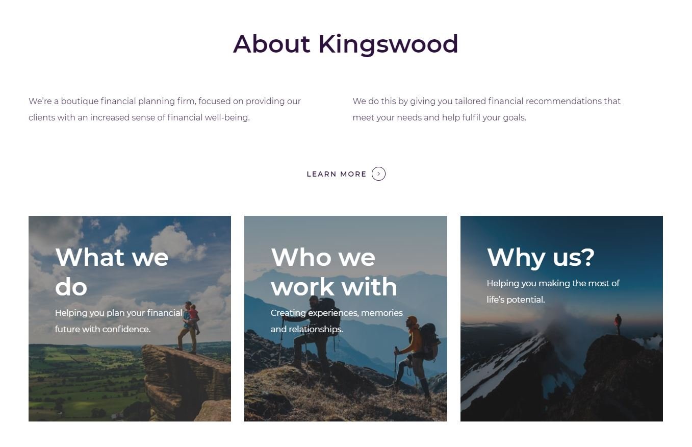
It’s no secret that the visuals on a website are just as important as the copy.
People engage more with visual content than they do with text-based content, so it’s important to incorporate that philosophy into your website design.
You should be designing your website around a visual theme which is relevant to your brand and keeps within brand guidelines.
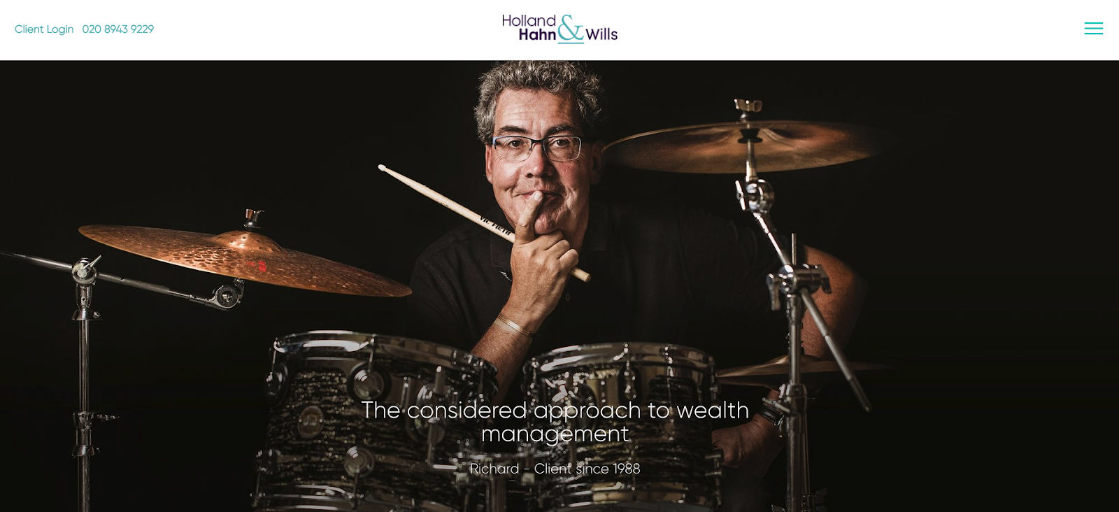
The concept of our site for Holland Hahn and Wills, for example, was to have all of their primary imagery based on their own clients.

Using high quality, relevant visual language can not only make your website stand out, it can also make the whole user journey a much better experience.
It’s the modern way
Hopefully, you can take a few of these pointers and implement them into your own website.
The main takeaway is that if you do have an outdated website then you should really be thinking about updating it or building a new one, as it could be damaging your firm's reputation.
Of course we are always on hand to help you with your new website project, so feel free to drop us a line.

